Showing posts with label art practice. Show all posts

Monday, January 30, 2017

The Cellist - Part II

G. Sivitz, oil painting, portrait, cello, cellist, art
Study for The Cellist
oil painting work in progress - Take II


Earlier this month I had the opportunity to work with a cellist as my model. It was an amazing experience which you can read about here, but while the study from that session was very spontaneous and fresh, it was also very rough. Since the cellist was willing to sit for me again, I jumped at the chance to improve upon what I had already done. I've been learning in leaps and bounds during these sessions, pushing myself waaaaaay out of my comfort zone and really surprising myself with what I've been able to pull off. I'm also falling into some classic beginner portrait painting traps. I think stating "I don't paint humans" is a defense mechanism so I don't have to feel bad if the piece doesn't come out. For example, the proportions of the cellist's hand and arm are off compared to her face, but I can just shrug my shoulders and say, "Well, what did you expect? I don't paint humans." While this keeps me from beating myself up about any mistakes, I have to be careful: I'm starting to really like painting humans...


Monday, January 23, 2017

Live Model Drawing

Still working on humans. Here are a few drawings out of my sketchbook from a couple of live model sessions I've attended in the last month.

Sivitz, sketch, woman, graphite, white charcoal, figure drawing, art
Model with head scarf
Graphite and white charcoal pencil on tan paper.


Sivitz, man, male, drawing, sketch, graphite, white charcoal pencil, figure drawing, art
Model at Sketch Club
Graphite, charcoal pencil and white charcoal pencil on tan paper.


You may have noticed that most of my sketches have the model turned away from me. It's because I'm terribly intimidated by drawing faces. I forced myself to draw this model's profile and thankfully it didn't turn out half bad. Maybe I'll be a little braver next time. Then I have to conquer my fear of drawing hands...

The cellist I painted in my last post sat for me again this weekend! The study of her that I've been working on has come a long way. As soon as I can get a good photograph of it, I'll post about it.

Monday, January 16, 2017

Can I Paint You?


cello, musician, sketches, graphite
Warm up sketches


Although I enjoy painting and drawing people occasionally, I don't think of myself as a portrait or figure painter. I tend to do it as an exercise, but the more I've been attending live model sessions, the more I've been noticing people in general; the way the light shines across someone's face, or a particularly interesting-looking person in a crowd. A few times I've seen someone who I desperately wanted to paint, but had no idea how to go up to a perfect stranger and ask, "Can I paint you?”. Er, awkward! 


Even though we live in a smaller city in a rural area, we do have a surprisingly good symphony orchestra. At a concert last year I noticed how one of the cello players and her instrument had a perfect combination of lighting, colors and form. Every concert we attended after that, I'd sit there and try to figure out how in the world I could get a chance to paint her. "Just go up and ask her after the concert." my husband would say. Uh yeah, right.

Finally this past November, after a particularly wonderful concert, I figured what have I got to lose? So at the end of the performance while the musicians were packing up their instruments, I pushed my way through the exiting crowd to the base of the stage. I managed to get the cellist's attention and introduced myself, complimented her on that evening's performance, and explained that I was an artist and I wanted to paint her playing the cello. I handed her my business card and told her to check out my website, think about it, and if she was interested, to email me. She didn’t back away from me or call security, so that was a relief, but I was surprised when she sent me an email two days later. She was interested!

Our schedules finally coincided last Saturday and we met at our local art center. This was the first time I’d ever arranged a model for myself, and her first time posing. In a lot of ways this felt like a first date back in high school, with all the awkwardness and worry. I was nervous about what she would think of my art. What if I accidentally offended her with poor painting skills or a less-than-complimentary likeness? I also wanted to make sure she had a positive experience. I knew that holding a pose is hard work and since she was new and volunteering to do this for me, I didn’t want to ask too much so I just told her to practice and I’d work while she played.

We both warmed up with some exercises; me sketching and her tuning up and playing scales, and then we both launched into our respective art forms. I’ve had music on while I’ve painted before, but having someone play live while you are working adds a whole different dimension to the experience. I picked up on the energy of the music and the musician’s movements. I found that I wasn’t thinking - just reacting with my paint. My brushstrokes were much looser than usual. It really was an incredible feeling. It was challenging to paint someone who was constantly in motion, but in hindsight, I think it would have felt very stale if she had held a pose, pretending to play.


musician, painting, oil, cello, portrait,
Study of Cellist - WIP
16x20 inches, oil on canvas

Fresh snow was beginning to pile up outside, so we ended the session a half hour early. My mental energy was starting to lag anyway, after such an intense bout of painting. I asked her to get in touch with me sometime if she was ever interested in modeling again. Much to my surprise, she texted me later that evening and said she would like to! I am definitely looking forward to the next session.

Technical notes: A week after I first approached the cello player at the concert, I saw this article online about asking strangers to model for you. It would’ve been helpful to me to read beforehand, but it also felt good to know I’d navigated the process on my own. I’m sure that not everyone I ask is going to have a positive reaction to me wanting to paint them, but this was certainly a good first experience. 

If you are painting someone's likeness, don't forget to consider if you should use a model release contract. Here are a couple of articles on the topic: here and here

During the painting session I used a Thomas Sully palette that I was introduced to during a figure painting class at the Pennsylvania Academy of the Fine Arts with Ted Xaras in 2014.

Wednesday, November 30, 2016

Blackbird Woodcut

I may have mentioned in passing that aside from oil painting I'm crazy about printmaking, specifically woodblock printing. I've tried linocut printing (carving an image out of a block of linoleum) but there's something about working with wood that I really love. I usually work with white pine, since it is a soft wood and easy to carve. Over the last couple of months I've been working on a woodcut of a blackbird in reeds.

The inspiration

During spring migration, male yellow-headed blackbirds congregate in huge numbers at Bear River Migratory Bird Refuge in Utah, just north of Salt Lake City. On our annual trip to the Refuge, we see hundreds of them at a time and this year the image of them in the reeds really struck me and ideas for a painting began to form.


While I was sketching studies and thumbnails for a painting it occurred to me that the scene would also make a great woodcut image, so I changed gears and began working on a print.

The bird's face reminded me too much of the bald eagle in The Muppets.

At first my plan was to use just one block of wood and black ink, however I was not happy with the bird's face after seeing the first proof. The only way to change the face was to completely carve it away and create a second block with a new face carved into it which would print over the first block. Since I was going to the trouble of carving a second block, I decided to change a few other things, too. Can you spot what I changed?

The new face

I printed the original block of wood with gray ink and printed the second block with black ink on top of the gray layer and got some interesting results. This got me thinking about printing with multiple colors. I think this might be part of the reason I love working with woodblock - it seems that every step leads to a new idea.

The brown layer.
When I inked the block, I wiped the brown ink off the area of the bird
before printing so that the bird's black ink layer would print clean and sharp over top.

So I printed the original wood block with brown ink, then inked the second block of wood with blue in the water areas and black on the bird and printed that over top the brown layer.

The completed image

The random black marks in this print are happy accidents. The unexpected things that happen with printmaking is one of the things I love about working in this medium.

For now I'm pretty pleased with this print, but I may make more changes as they occur to me.

Thursday, November 17, 2016

Options for Painting Lights and Darks

In my oil painting class for beginners, we've started to delve into color after working in black and white for a while. This week I did a painting demo for them showing two different ways to lighten and darken an object, in this case an apple, so they could compare the two methods side-by-side.

Apple 1

The first method I showed them was using white to lighten and black to darken the paint. I used titanium white, but I did mix my own black rather then using a tube black. I think the difference between the dark areas of the two paintings would have been more striking if I'd used black from a tube (full disclosure here: I forgot to bring a tube of black). It's been a long time since I used white as my predominant lightener and it felt awkward. I had to really concentrate and fight my now-automatic color choices!

Apple 2

In the second painting I used yellow and orange to lighten the apple and only added white when absolutely necessary. For the dark areas, I used purple and blue. I had planned to use a more white-looking tabletop color, but I accidentally put a streak of that rusty peach color down and we all loved it, so I kept going with it.

While comparing the two paintings side-by-side, the students commented on how much more vibrant Apple 2 was, and they noticed that in Apple 1 the white mixed with alizarin crimson created a pink tone, rather than a sense of light striking the apple. As they were leaving class pondering all these color choices, one student half-jokingly said, "Can't we just go back to black and white? It's so much easier!"

Thursday, November 3, 2016

The Delights of Drawing

"The process of drawing is, before all else, the process of putting the visual intelligence into action, the very mechanics of visual thought. Unlike painting and sculpture it is the process by which the artist makes clear to himself, and not to the spectator, what he is doing. It is a soliloquy before it becomes communication."
                                                                                                   ~ Michael Ayerton


G Sivitz, sketch, drawing, graphite, sketching materials, pencil, notepad, art
Drawing materials - graphite on paper

Every time I've been away from drawing, when I return I am reminded of how much I love to draw. To me, it is very soothing and comes much more naturally than painting. But perhaps that's why I take it for granted, that is until I haven't done it in a while.

G Sivitz, sketch, drawing, graphite, watch, art
Wrist Watch - graphite on paper

There are endless things to draw around us all the time and no expensive materials or lengthy set-ups are needed, so I have no excuse not to draw. When I am in a drawing phase, I like to get out of bed and draw something before I do anything else. It's a wonderful way to start the day.
G SIvitz, drawing, sketch, shirt on hanger, art
Shirt on a hanger - graphite and white charcoal on toned paper.

Everyone has their preferences, but my favorite drawing tools are mechanical pencils and Pigma Micron pens, which I will occasionally add watercolor to. I prefer paper with a smooth surface. I started using Strathmore 400 Series Toned Tan paper this summer and I really love the effect of the white charcoal pencil on the tan paper. It's been a nice change from white paper.

So now that I'm done the 30 Pears project, I'm eager to get back to making daily drawing a priority.

Tuesday, November 1, 2016

Drum Roll Please - Pear #30


G Sivitz, oil painting, pear
Pear #30
6 x 6 inches, oil on canvas panel

Have you ever been to a fantastic workshop that was incredibly intense and you learned an amazing amount, but by the last day your brain had shut down and you just couldn't force another bit of information into it, no matter how hard you tried? That's kind of how I'm feeling at the end of my 30 Pears in 30 Days project. Worthwhile? Yes! Exhausting? Oh yeah.

I had fantasies of my 30th painting being so brilliant that blog-readers were blown away by the difference between Pear #1 and Pear #30. Well, that remained a fantasy. Honestly, I could barely think straight as I painted this final piece. Sure, it would've been nice to finish the project with a stunning painting, but in the end I'm just happy it's done. There will be other chances to paint stunning pieces. Right now I am in desperate need of some rest and some time to absorb everything I've learned this past month. A break from painting pears might be nice too, although surprisingly I do still like them.

So did I achieve my goals for this project? Did limiting the subject matter lead to greater creativity and getting a good workout on some key artistic concepts? I believe it really did. I explored color palettes and color temperature, brushwork, and composition. I concentrated on tricky things such as fabric, and I tried to loosen up, be more expressive, and not overwork things (still struggling with that one!). And at this point, I think I could paint a pear blindfolded.

I am looking forward to blogging about other things now, looking forward to not having a daily deadline hanging over my head. There are woodblock projects to work on and I want to get back to my sketching routine. However, I've got a collection of vintage Hall china teapots that keep catching my eye. I wonder what a month of painting those would do...

Monday, October 31, 2016

Pear #26 - 29: Lots More Experimenting

"A deadline is negative inspiration. Still, it's better than no inspiration at all."
                                                                                            ~ Rita May Brown

Pear #26

As I type, there's a severe thunderstorm giving a final lashing to our area before it moves on. I fully expected the power to go out tonight, leaving me to paint Pear #30 by candlelight. Thankfully that didn't happen and my last painting for the month is finished and waiting for daylight so I can photograph it and post my final 30 Pears in 30 Days on Tuesday. It's no beauty, but it's DONE.

I apologize for the less-than-perfect photos of Pear 26 - 29. It's been gloomy out for a few days now, so I've been completely dependent on indoor lighting for photos. Even with color-corrected bulbs to augment the regular room lighting, my camera has not been happy.


Pear #27

This one, however, is not the camera's fault. I don't even know what to say. What happened???


Pear #28

Experimenting with temperature shifts across the folds of the cloth. This is one of those pieces that I absolutely love parts of and can't stand other parts.


Pear #29

I had a lot of fun with this one. I added naphthol red to my palette, which mixed with cadmium yellow light to make the delicious orange in the foreground. If you look carefully, I've got the full spectrum (good ol' Roy G Biv) represented here.

Happy Halloween everyone! 


Friday, October 28, 2016

Pear #21 - 25: More Exercises and a Whole Different Palette


G Sivitz, oil painting, pears, earth tones, art
Pear #25
6 x 6 inches, oil on canvas board


I have to admit to feeling a little pressure right now. The end of October is fast approaching and I lost a few days for painting this month when Life happened, so I'm running slightly behind. Although I profess to believe in the importance of sharing both good and bad efforts to show that artists don't create perfect paintings every time, I am sweating the quality of some of these pieces. That's why Pear 21 through 24 are not displayed at the top of this post...

However, I suspect that Pear 21 through 24 directly led to Pear 25, and not just numerically. I tried another exercise from Sarah Sedwick; this one on brushstroke economy. I painted my pear model 4 times, for 10 minutes each time. However, I was only allowed 25 brushstrokes in the first painting, then 20, 15, and finally just 10 brushstrokes in the last painting. (A brushstroke is from the time you touch the canvas with the brush to the time you take the brush off, so you can swirl the paint around a lot, as long as you don't lift the brush off the canvas.) Finishing the background was not a requirement. The point is to really think and observe, and consider each brushstroke very carefully. What do you really need to create the impression of your subject?


Pear # 21 - 24
Limited brushstroke exercise


Oh dear, I didn't do very well with this one. I often used up my brushstrokes long before the timer went off, which meant I was rushing and not concentrating on my subject. I came out of the exercise not only with some very ugly pears, but also knowing I hadn't gotten the point of it. I was feeling very frustrated with myself. I knew I needed to keep going and paint another painting, but my brain was refusing to cooperate. I looked down at my palette and felt an overwhelming sense of frustration and boredom, and I was very reluctant to pick up my paintbrushes.

As I was hesitating, I had a mini-temper tantrum inside my head. I berated myself for ever committing to this Pear Project, telling myself I was going to fail and embarrass myself, and that I was never going to be able to paint another decent painting ever again. Luckily another, louder part of me stepped in and decided that if I was going to fail, then I should just have some f*****g fun. I was sick of the palette I'd been using all month, sick of trying to get the values and shapes right: I just wanted to paint. So I cleared off my palette and grabbed the colors that appealed to me at that moment: yellow ochre, Indian red, Venetian red, burnt umber and raw umber (I couldn't find my siennas, otherwise I would've included them, too.). I made a very sketchy drawing of the pears on the canvas and then just started adding paint all around them. It was all very spontaneous, and when I was done it surprised the heck out of me that I discovered I actually liked the piece.

This was exactly why I took on this project in the first place - to see what would happen when I pushed myself, when I got bored, to find out if there was some way to tap into the more expressive side of my creativity. I just hope that I don't have to go through such angst every time I want to paint like that!

Thursday, October 27, 2016

Pear #19 & 20 - Color Scheme Shifts


G Sivitz, oil painting, pears
Pear #19 - Experimenting with reflections

I seem to be unconsciously shifting towards more earth tones and darker colors. Perhaps it's all the brown leaves drifting down past my window, or perhaps it's that Halloween is in the air...

G Sivitz, oil painting, pears
Pear #20 - using up what was on my palette


Wednesday, October 26, 2016

Pear #15 - 18

"I must continue to follow the path I take now. If I do nothing, if I study nothing,
if I cease searching, then, woe is me, I am lost. That is how I look at it -
keep going, keep going come what may.
                                                                                                ~ Vincent Van Gogh

G Sivitz, pear, pear painting, oil painting, still life
Pear #15
6 x 6 inches, oil on canvas board

I have long admired other artist's rendering of cloth, especially if the fabric has a pattern on it. Oh, those tantalizing polka dots, plaids, or stripes! My hope during this month was to experiment enough with painting fabric that I would achieve a decent ability to reproduce it. When I completed this painting, I did a little happy dance in front of my easel.

oil painting palette
My palette
Mmmm, love all those luscious greens


I should note that I added cadmium yellow light alongside my usual azo yellow in my primary color line-up this time.

I also did a couple of demos for my beginning oil painting students: 

Pears #16 and 17 - each done in 10 minutes.

One was Carol Marine's classic 10 Minute Apple exercise - only obviously I did it with pears.


Pear #18 - study in blue and orange

The other demo was to paint using only complimentary colors - this time blue and orange. This was also a good example of "do what I say, not what I do" as I overworked this one!

I can't believe it's October 26th already! This 30 Pears project has been great, but I'm going to have to start cramming my posts with paintings if I'm going to show you all 30 pieces by the end of the month!

Monday, October 24, 2016

The Rejects

 "To try and fail is at least to learn; to fail to try is to suffer the inestimable loss of what might have been."
                                                                                                   ~ Chester Barnard


The duds. Let's call them Pear #12, 13 and 14

The problem with painting is that it doesn't always go well. Many paintings, for whatever reason, miss the mark and end up in an artist's reject pile. Even the great Masters painted over unwanted pieces, which modern science is now allowing us to see. (If those artists knew we were exposing their abandoned works, I wonder how they'd feel...) This should give us artists some comfort, but I will admit it is small comfort to me. As many times as I tell my students "Every painting is just practice for the next.", my failed paintings eat away at me. I was not even going to show you the "bad" paintings from my 30 Pears in 30 Days project, but if I didn't then I'd just be perpetuating the belief that a "real" artist has talent that magically makes every painting perfect, which I firmly believe is a myth that needs to be dispelled. So many people give up on making art because their work is not perfect.

My mother subscribed to this belief, which is why she did not support me as a developing artist. I stopped showing her my work after a while. Many years later she happened to see some of my work through a family friend and was shocked at how far I'd come. Yet this still didn't dispel her belief in the myth. A few years later she decided she wanted to learn how to draw, so she enrolled in an evening class for beginning drawers. She quit after two classes because, in her words, the instructor hadn't taught her how to draw.

There is no magic formula to making art - just hard work and study. Art, just like any other skill, takes practice. Lots of it. Years and years of it. And even when you've reached a certain level of mastery, there will still be bad paintings, bad days when you wonder why you're even bothering, months when you wonder if you'll ever be "good enough". Too much self-doubt can lead to giving up, but in moderation, that doubt is a good thing. Perhaps without that doubt, we wouldn't push ourselves to keep getting better. If we thought our work was already perfect, we might not be motivated to keep improving. As the Robert Hughes quote goes: "The greater the artist, the greater the doubt. Perfect confidence is granted to the less talented as a consolation prize."

Wednesday, October 19, 2016

Art and Stress


stressed out, morguefile
STRESS!

Our internet service was down for 4 days less than a week before my 30 Pears in 30 Days project was due to start. I had a long list of things I needed to take care of for my website, Etsy store, the new blog, etc. I was feeling a little stressed and overwhelmed, to say the least.

Life is stressful enough as it is, but being self-employed or an entrepreneur in a creative field has its own special set of stressors. We need to be focused and energized to accomplish all we have to do, as well as relaxed enough to allow creativity and new ideas to flow, and unmanaged stress can zap our ability to do any of that. Top that with the surprising number of artists who are full-time caregivers, or live with chronic pain, or any other added long-term stressor, and it’s amazing anyone can finish a piece of art.


cat, relaxing, sleeping cat,
If only we could relax like this!
Spending time with animals is a good stress reliever.


Dr. Eric Maisel is an author and creativity coach who writes a column for Professional Artist Magazine. In a blog post last year, he discussed stress and the artist:

            “An artist needs to honor the reality of stress and make plans
              for dealing with it...

            Take some time, have a fruitful conversation with yourself and
             answer the following four questions:
            1. What are my current stressors?
            2. What unhealthy strategies am I currently employing to deal
                with these stressors?
            3. What healthy strategies am I currently employing to deal with
                these stressors?
            4. What new stress management strategies would I like to learn?”

We’ve all heard the “eat right, get enough sleep, and exercise regularly” recipe for stress-busting, but honestly, when I’m stressed out, that doesn’t help much. Through trial and error, I’ve had to figure out what works for me. I hope you find something here that’s helpful to you.

chocolate, photo, morguefile
Mmmm

Chocolate has always been my go-to quick relief for stress, and there's scientific proof to back me up. Eating dark chocolate (in moderation!) actually helps reduce stress hormones in the body. Hurrah!

I’ve had an on-again, off-again meditation practice for 5 years now. When I meditate regularly, I feel much more clear-headed and better able to deal with Life’s little surprises. However, there are times when my mind is just too active or distracted by something to be able to meditate on my own, so I also use guided meditations, or guided visualizations to help me relax. I just pop on the headphones and let someone talk me into relaxation.


One of my favorite guided meditation/relaxation collections is from Joanne D'Amico and her "Relax for A While" channel on YouTube. She has the most amazingly soothing voice, and many of her guided meditations are short enough to use as a quick break during a busy day. Some of her videos include relaxing sounds such as rain or a babbling mountain stream. (My apologies - try as I might with YouTube's Share/Embed settings, I could not get the YouTube related videos at the end of this video to go away. According to the HTML, they shouldn't be there, but they are. At least I managed to eliminate the ads at the beginning!)

Okay, so maybe this sounds a little crazy, but I find doing the dishes relaxing. I kind of get into a zone in my head and the sound of water probably helps. Weeding the garden helps me de-stress as well. It's so satisfying to pull out stubborn weeds!

Many people find putting on upbeat music helps to clear their head and get them in a better mood. You can burn off the stress (and maybe some of that chocolate) by dancing to the music or playing air guitar. Even just a few minutes can make you feel better.
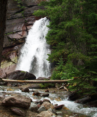
waterfall, forest, Glacier National Park, photo
Nature is a natural stress relief

Getting outside in the fresh air, whether to a local park, your own backyard, or out in the wilderness is a wonderful stress reliever. Throw a ball around, play with your dog, go hiking. If you've been holed up in your studio for too long, maybe it's time to see what that bright thing in the sky is.

We've now come full circle: just the act of creating art has been scientifically shown to decrease stress in the body, regardless of whether you're "talented" or not. So perhaps when we are feeling stressed, we just need to drop everything and make more art.

Please leave a comment and share what you do to combat stress.

Tuesday, October 18, 2016

Pear #10 - More Color Experimenting

"Colouring does not depend on where the colours are put, but on where
the lights and darks are put..."
                                                                                        ~ William Blake


G Sivitz, pear, oil painting, yellow and purple
Pears in yellow and purple
6 x 6 inches - oil on canvas board

As I said at the beginning of this month-long project, my intention for painting 30 pear paintings was to allow me to explore some key artistic concepts without always having to come up with new subject matter. For this painting, I wanted to work on breaking my dependency on the color white. When we lighten colors simply by adding white, we dull the color and often the painting comes out looking chalky and not as vibrant as we might like. For this painting, I used only yellow and purple; purple replaced black and yellow replaced white on my palette. I found it interesting that my color mixes ended up being much more green than I had expected; my purple mix must have leaned more towards blue.


oil paint, colors, palette
My palette with my usual colors at the top, and
the yellow and purple palette in a 8 step value scale below.

Artist Sarah Sedwick has a YouTube demo that she filmed for her online mentorship students, showing her working with a purple/yellow complimentary chromatic scale. In her demo, she's working with a still life set-up that is entirely white. I have yet to find a white pear, so I tried the exercise with a white & green tea towel on a white tabletop with my yellow-green pears. My yellow/purple combination certainly didn't make the most attractive shades of color, but I enjoyed the exercise and, as a bonus, gained more practice rendering cloth.


G Sivitz, oil painting, grayscale, pears
Painting converted to grayscale.

Monday, October 17, 2016

Pear #9 - Changing Up The Color

"He had that curious love of green, which in individuals is always the sign
of a subtle artistic temperament, and in nations is said to denote a laxity,
if not a decadence of morals."
                                                                                           ~ Oscar Wilde


G Sivitz, oil painting, pear,
Pear #9
6 x 6 inches, oil on canvas board

I love the intense reds and oranges I've been using lately, but with a wall full of these color schemes, I felt it was time to change up the colors.

I also set a timer so I wouldn't overwork this piece. I ended up finishing before the timer went off, which was very surprising. It made me wonder if my timer was broken, but when I took a peek it turned out I had ten minutes left! I'm really quite please with this one.

But nothing's ever that easy. A few hours later I accidentally bumped into my easel and this poor painting fell off, smearing some sections including the left side of the pear and the right side of the plate! Luckily I hadn't cleaned my palette yet, so I had leftover paint to patch this piece's injuries. How nerve-wracking to fix a painting you originally liked, holding your breath and hoping you can restore it instead of ruining it beyond repair. Somehow I managed. You can see the blotchy shine along the upper edge of the canvas where I tried my best to fix some other smears. Once I varnish this piece those areas will disappear, but I'll always remember what happened. 

Friday, October 7, 2016

Pear #5

G Sivitz, oil painting, pear
Pear #5
6 x 6 inches, oil on canvas board


This is my favorite pear painting so far. Everything just kind of came together. I love the bold colors, the way the pear is rendered, the composition. But of course this makes the next painting more difficult. The pressure's on to see if I can top this one, or at least equal it. Why do we do this to ourselves?

Wednesday, October 5, 2016

Pear 4


G Sivitz, pear, oil painting,
Pear 4
6 x 6 inches, oil on canvas panel


I decided to go a little more bold and a little more complex this round. I will admit to being petrified as I painted the pattern on the blue china pot. It seems silly to have been so nervous about it since I planned to keep the pattern fairly abstract, but I had to keep reminding myself to breath.

Tuesday, October 4, 2016

Pear 2 & 3


oil painting, pear, Gabrielle Sivitz
Pear #2
6x6 inches, oil on canvas paper


Time is flying - only 27 more pear paintings to go in the 30 Pears in 30 Days project! 

I'm not sure why I decided to include a plate in this one, since ellipses are tricky to get right. Nothing like an added bit of pressure, second painting in. Luckily it didn't turn out half bad.

oil painting, pear, Gabrielle Sivitz
Pear #3
6x6 inches, oil on canvas paper 

I used a limited palette of blue-violet and yellow-orange for Pear #3. Mixing the two together in equal parts gives a nice neutral which I used for the pear stem and the surface the pear sits on, adding a touch more yellow-orange for the warm well-lit part and adding a little more blue-violet for the shadow part. The pear itself is a mix of the two colors, but with enough extra blue-violet to appear greenish, and then enough yellow-orange to appear yellowish in the highlighted areas. The specific colors really don't matter that much, though. As long as the values of the colors are correct, the pear will appear 3 dimensional and pear-like no matter what colors I choose. I could've painted this whole scene in lavender and it would still read "pear". Hmm, that gives me an idea..

Monday, September 26, 2016

Sketching Pears

Art does not reproduce what we see; rather, it makes us see.
~Paul Klee
sketch, pear, graphite, charcoal, toned paper, GSivitz
Sketch of a pear
graphite, charcoal, and white charcoal on toned paper.

In preparation for my 30 Pears in 30 Days starting October 1, I've been doing some sketches of pears in various settings as part of my morning sketching routine. Getting to know my subject, as it were...

sketch, pear, graphite, charcoal, old books, toned paper, GSivitz
Sketch of a pear with books
graphite, charcoal, and white charcoal on toned paper.

I've never been a fan of eating pears, but I am developing a great appreciation for their form and all the different subtle colors on them. People at the grocery store must think I'm crazy, picking through all the pears to find just the right one.

A note on the sketching surface I'm using - it's Strathmore 400 Series Toned Tan paper and I really love the effect of the white charcoal pencil on the tan paper. I started using it over the summer and it's been a nice change from white paper.

Friday, September 23, 2016

Welcome to My New Blog and a Project Announcement

New blogs can feel momentous, overwhelming, and trying to write the perfect first post can easily lead to procrastination and writer's block, so in order to side-step that trap, I'm going to jump right into my new blog home. Please excuse any unpacked boxes. The furniture may not be exactly where it's going to end up, but it's a start.

Announcing the 30 Pears in 30 Days project.

photograph, pear, model, GSivitz
My pear model, getting ready

You may be familiar with Leslie Saeta's Thirty Paintings in Thirty Days Challenge, where artists from all over the world create and post their work each day for a month. Nothing improves your artistic skill like doing something every day. A group challenge of this nature gives the participants the advantage of having other people for support, for sharing and inspiration, and for accountability. However, because, as my husband often reminds me, I like doing things the hard way, I'm doing this on my own. I will be creating a small painting of a pear every day from October 1 - October 30 and posting the results on this blog. Unfortunately National Pear Month is in December (Yes, I looked it up...), but, as my husband also reminds me, I am impatient, so I'm doing this now.

The purpose of this project is not just as a gimmick to get you to come to my new blog regularly, or to make me feel really productive, but also to see if limiting the subject matter will help me to hone my painting skills and allow for greater creativity. I often think of the process of painting like juggling plates on sticks. There are so many different choices you have to make in a single painting: composition, value, color, subject matter, to name just a few, and each of their subcategories. To have a successful painting you ideally keep all of those plates spinning at the same time. I'm guessing that if you took away one or two plates by arbitrarily setting some parameters, you could concentrate better on the other plates and end up with a more successful painting, as well as really getting comfortable with some key artistic concepts. So that's the plan, and at the end of October we'll see if my theory held up, so stay tuned...


POPULAR POSTS